Calling go-getting venue marketers! In this series we discuss the basics of online marketing for venues. We’ll talk about social media, SEO, search marketing and a lot more - all great (and often free) ways to generate new customers for your venue. Enjoy!
Like 2014, 2015 will be a year in which mobile grows and grows. Ensuring a mobile presence is crucial for online marketers, and it should, if we're honest, take up more than one chapter of this series. Suffice to say we will be mentioning it frequently!
“But surely hardly anyone goes venue finding on their mobile" some might say. This is a dangerous misconception, and increasingly so.
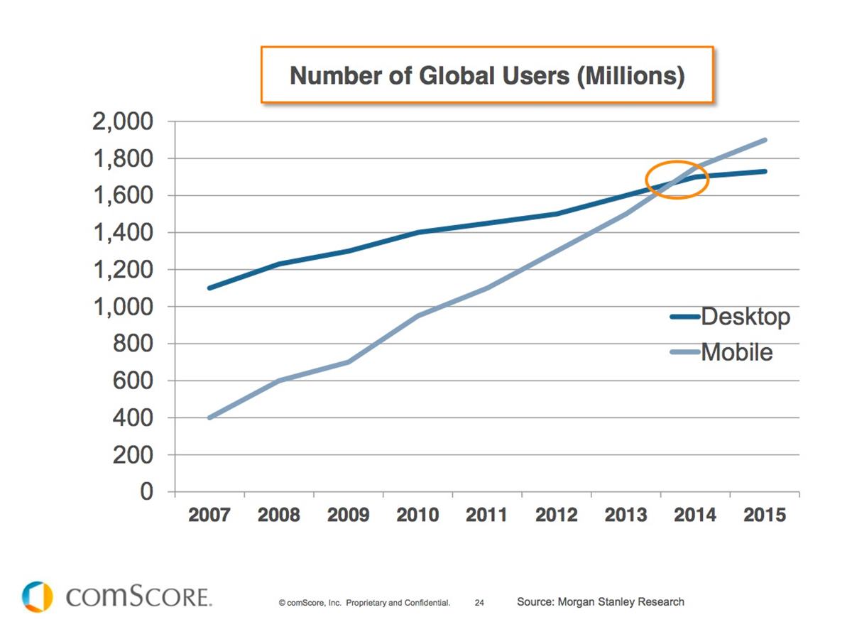
Over the past decade, the shift in internet use towards mobile devices has been strong and unrelenting. What's more, it is only increasing.

This year, for the first time in history, mobile internet use over took desktop internet use. This is not something that is going to go away and is only going to grow in importance. We can look at our own data from Hire Space as a good way to specifically understand people who are looking to find a venue. While our mobile use is below average due to the number of corporate event and conference bookers who use the site, only 56% of our users are on a desktop, with 33% on mobile and 11% on their tablet - the stats will not be very different for your customers on your website.
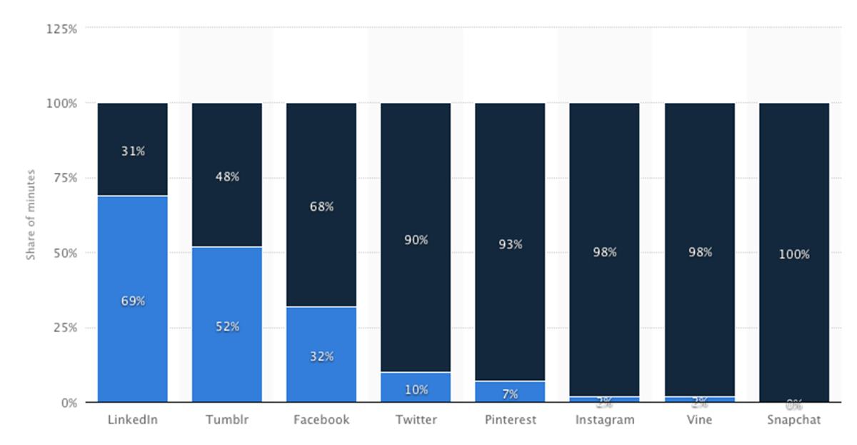
For those looking for new customers on social media, the the dominance of mobile is even more pronounced.
Statistics show that, in 2014, 68% of Facebook use was on a mobile device. For Twitter the results were even more extreme with 90% users on their mobiles. Even when looking at our own numbers at Hire Space, 92% of the traffic we receive from social websites is on mobile.

So, mobile is clearly important, but what can you do about it? Fortunately, there are some simple steps you can take to stay ahead of the competition.
Making your website mobile friendly
Making your website awesome on mobile can be quite frustrating, as we all need to enlist the help of a technical whizz-kid to actually make things happen. It can be quite easy to think this is their job, but there is much you can do to help them and make sure you get it right together. Equally, if it's not right, it's up to you to make sure it is fixed.
Mobile First
The role you played in your website might have involved approving a design or sketching roughly what you want, and handing it to a developer. The chances are that this was design for the desktop version of your site or a sketch on an sideways piece of A4 paper.
This is the old way to do things, and risks forgetting about the majority of your users.
Top modern web designers will start with the mobile design first, and then think about how to expand it to desktop. What are the really, really important parts of the page which everyone needs? Which parts are just add-ons for your desktop users?
This is how your web team should present a new site or idea to you, and if they don't then alarm bells should be ringing. You can't build a website yourself, but it is up to you to choose a design that works for all your users.
Mobile Friendly (according to Google)
So now you're looking at your new “mobile first” website, but how do you know if it's any good? What things should you check on your existing website? Fortunately Google has a handy three point guide.
1) No horizontal scrolling
Is there anything worse than a web page where you can only see the top corner and have to scroll sideways to see the page? Not according to Google.
2) Readable text
Take a look at your website on your phone, is all the text large enough to read? Is it large enough for your parents to read? Google need the text to be large enough for your parents to read.
3) Clickable links
Have you ever seen a tiny menu of tiny links, each of which is far too small to click without clicking all the others? Are these tiny unusable menus on every page of your website? Make sure all your links can be clicked with the fattest fingers.
Recently, Google has even started to remove non-mobile friendly websites from its mobile search results. You can see this with a quick Google search on your phone, all the top results will say "Mobile Friendly" in small grey writing on the left. If you haven't ticked the three boxes, then you might be throwing away half your customers.
So there you have it, a concise guide to the first steps in making your website mobile friendly. Mobile first design, no horizontal scrolling, readable text, clickable links. There is much more that you can do to market your venue better on mobiles, we have a team dedicated to it, but if you cover this you'll be ahead of 90% of the competition.
The full series
You can see the full breakdown for the series here - Online Marketing For Venues - Agenda, and view previous posts below:
- Introduction
- A brief history of online marketing
- On page SEO
- Linkbuilding
- Mobile
- Google Analytics
- Introduction to Content Marketing
- Introduction to Facebook Marketing
- Introduction to LinkedIn Marketing
- Introduction to Twitter Marketing
Email us on getonline@hirespace.com if you want to receive these updates direct to your inbox as soon as they go live. And do feel free to make suggestions in the comments box below if there are any topics you'd like us to cover. We're more than happy to add new subjects if there are any specific interests.
We're looking forward to helping venue managers drive more customers to their venues. As ever, please comment below for any suggestions or questions.
Finally, email us on getonline@hirespace.com if you want to receive these updates direct to your inbox as soon as they go live. And do feel free to make suggestions in the comments box below if there are any topics you'd like us to cover.


